
Here’s the activity itself! Below is my commentary and explanations.
Maxwell-Boltzmann distribution graphs are a way to represent the varying speeds of particles in a sample of gas. They are often tested on the AP Chemistry exam, and they get at the heart of a few important chemistry concepts:

- Particles in a sample of gas don’t all have the same speed.
- Gases at a higher temperature will have particles moving, on average, at faster speeds.
- Heavier (more massive) particles, at the same temperature, will move slower. (from the KE = 1/2mv^2 equation)
- The basics of kinetic molecular theory
In previous years, I’ve used some good resources to teach Maxwell-Boltzmann Distributions, including the POGIL activity on the topic, a few videos I’ve found online, and the PhET Gas Properties Simulation. But I’ve never felt great about my students’ understanding of the graphs afterward. They usually can draw them, but they often don’t really get what the area under the graph means or why the peak is lower when you shift it to the right.
So I thought, “What if students could start with some (made-up) data and create the graphs themselves? What if they could see exactly where the shape is coming from by plotting it out themselves?”
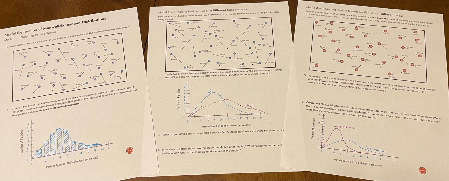
I created a model exploration activity where students could create their own Maxwell-Boltzmann graphs.
In the first section (Model 1), they count how many particles are moving at each speed, then graph it. I specified bar graphs on this because it sort of gets at the idea of the area under a curve (which my students won’t really learn about until calculus next year).

In Model 2, I show the same sample of gas after it has been heated. Students repeat the process, showing both curves on the same graph so they can see how the graph shifts at higher temperatures.

Model 3 shows a sample of a different gas, which has a greater mass, but the same kinetic energy. Here I introduce the idea of the relationship between mass and velocity (at the same temperature). Heavier particles move slower (on average). They draw the Model 1 and Model 3 samples on the same graph and see how the curves shift for gases of different mass.

Finally, because the PhET simulation for this is just so good, I have them use the simulation to verify the graphs they’ve made and look for other patterns.

Here’s the full activity:
Also, here’s a video I made a while back on the effect of temperature and catalysts on reaction rates using Maxwell-Boltzmann distributions, which I use later on during kinetics:

This is a great activity. Thank you! My students have always struggled with really understanding what these graphs represent. I just assigned this to my AP Chem today. I’m hopeful that it will help them. I did notice that Model 3 is incorrectly labeled as “Model 2.”
LikeLiked by 1 person
Awesome! I’d love to hear how it goes.
And thanks for pointing that out! I just corrected it on the doc.
LikeLike